Introducing the Savory Redesign: Clean, Predictable, Fast
- Authors

- Name
- Akshay Kumar
- @akshaykumar90
- Published on
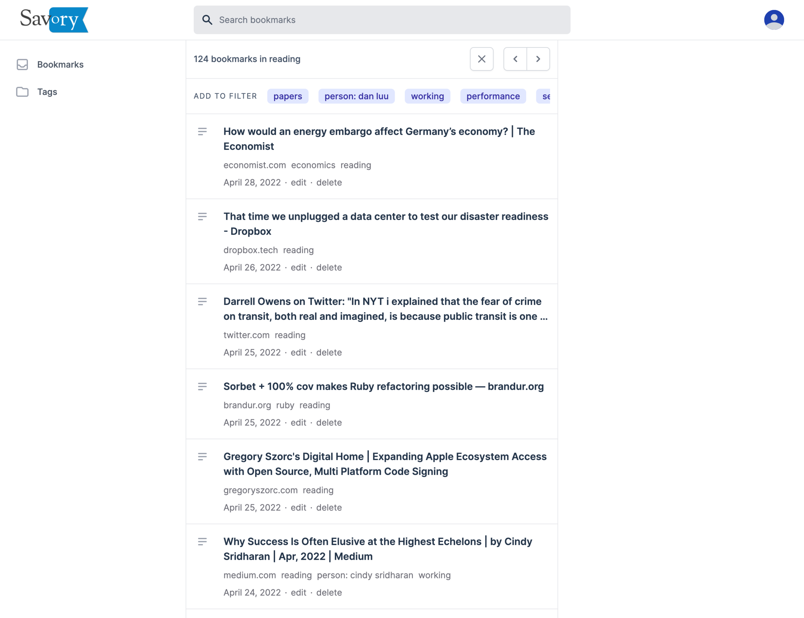
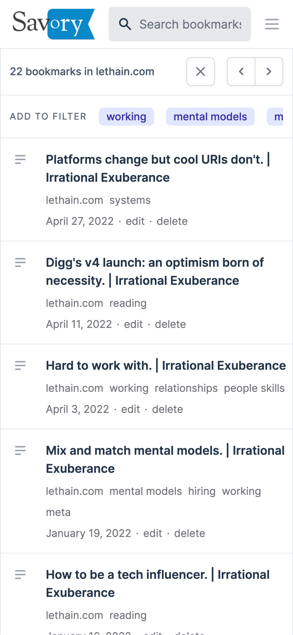
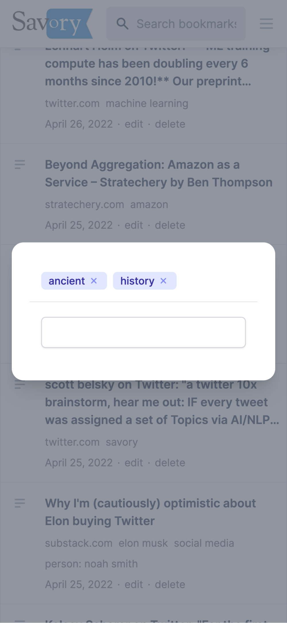
Today we are releasing a big update for Savory. We’ve completely redesigned the web app with a focus on user experience and design consistency. The new interface has high information density but does not feel cluttered. It will fill you with joy browsing your huge list of unread tabs (I know it’s a huge list). We also fixed very many annoyances and added some sorely missing features — you can finally cmd+click the tags, and search your bookmarks in the new mobile interface!
Savory is an app to save your favorite articles, papers, blogs, recipes, podcasts, cat videos, or those 100s of tabs that are sitting in your browser right now — anything you stumble upon browsing the web that is worth saving for later. The best part is the curation features making sure you are able to find that cute website later.
Why the redesign?
The main thing we had in mind when we started working on this was that the user experience (which is more than just the visual look) should feel solid. Users should feel confident navigating the interface, things should work as you expect them and there should be minimum surprises. I have been using the new design for a few weeks now, and I am significantly less frustrated than I was with the old design, where for example I could not cmd-click a tag to open it in a new tab.
In addition to that, the previous user interface felt very “brutalist”. All the content was just laid out in front of your eyes without any information hierarchy. When you are working with a long list of links, the app should help you scan things faster to find that one thing you are looking for. The new design should be a big step-up in that area.
A new cozy home for your tabs
Once we identified what needs to be done, we quickly realized that we need to tear the whole house down to build it right. Thankfully, Savory is still a small-enough app that this is not the worst idea. We use Vue as our frontend framework which had recently announced a major release (Vue 3) and some dependencies we were planning to use required the new version. We did the upgrade and in doing so, we have changed the previous shaky foundation to replace it with a strong modern base, thanks to Vue 3, Tailwind UI and others.
Since this was a ground up rewrite, we were able to sneak in some performance gains as well. Going from page to page within Savory should feel faster. The app even loads a lot faster than before.
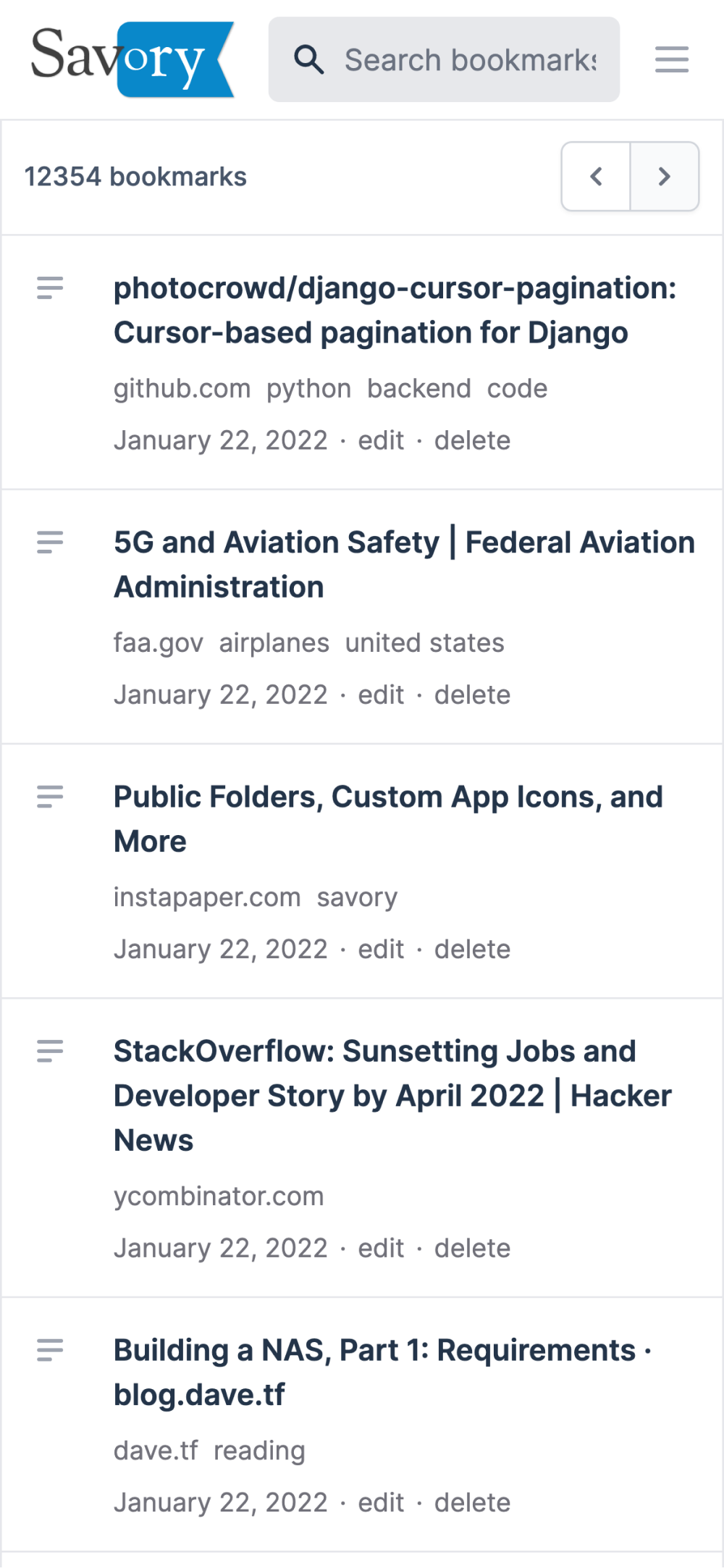
Oh, one more thing. It looks gorgeous on mobile. The previous design was never really designed for smaller screens so it did not work as well. Now, with this “new from the ground up” redesign, you would love to use it on your iOS and Android devices.
Try the new design today and let us know what you think. And don’t forget to install the Chrome extension to get started stashing those tabs in Savory.